AARP

SERVICES
DATA VISUALIZATION
ACCESSIBILITY
DATA PIPELINES
YEAR
2022
INFO
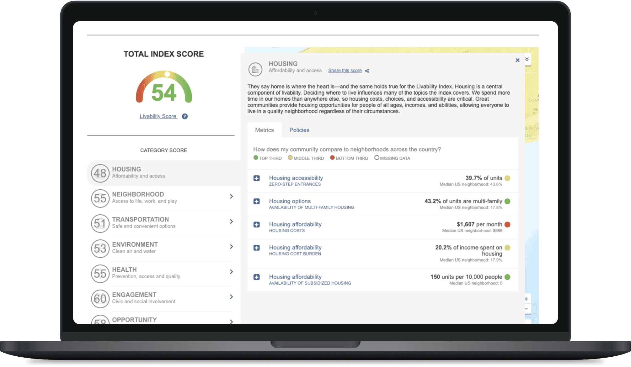
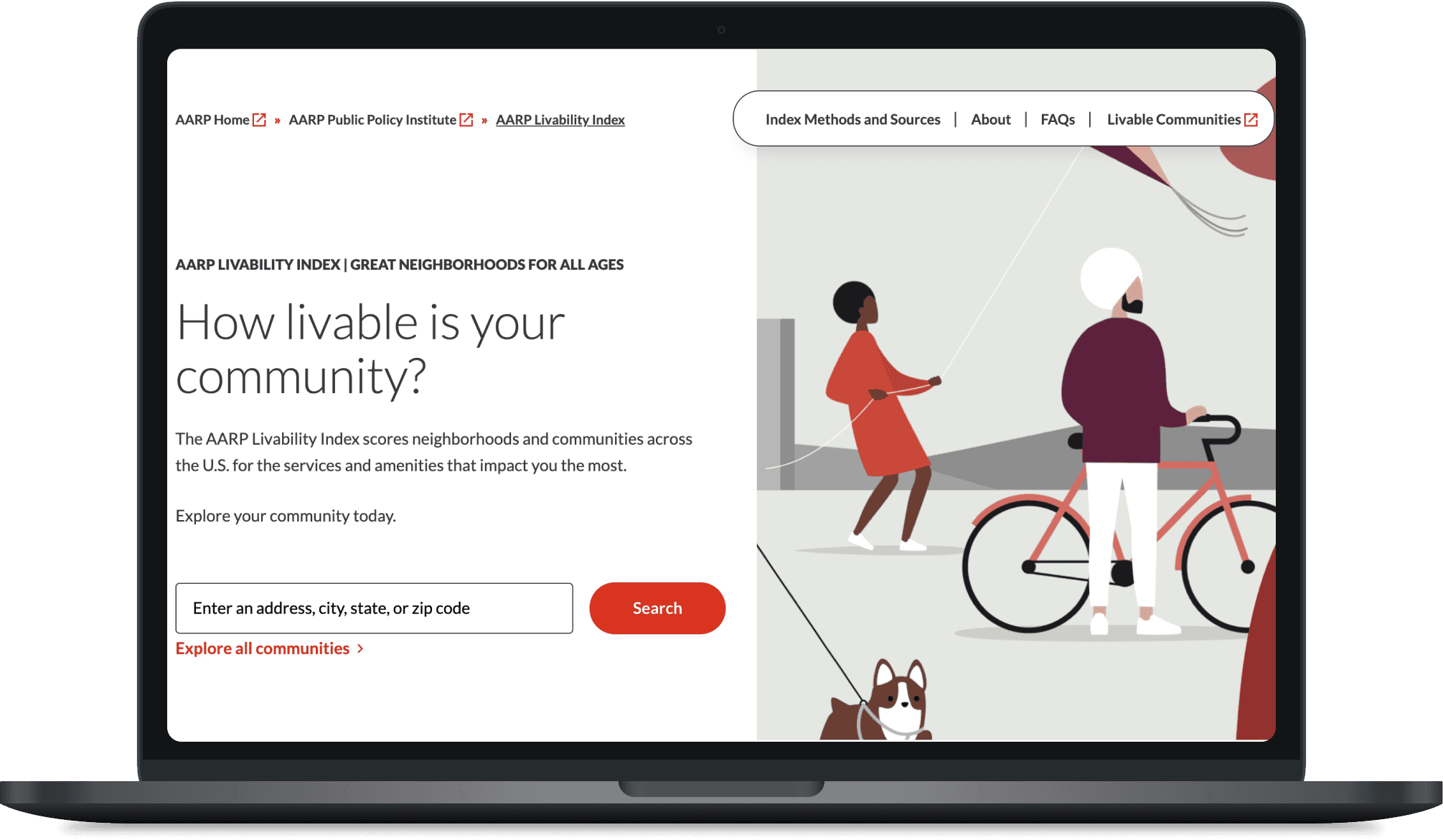
The AARP Livability Index helps people evaluate how well communities support quality of life through data related to housing, transportation, environment, health, and opportunity. The platform serves a wide range of audiences, including policymakers and consumers making housing decisions. These audiences have distinct content needs from the platform. I served as one of three designers on this project, translating the AARP brand to this newly redefined platform with new data visualization tools.
PROBLEM
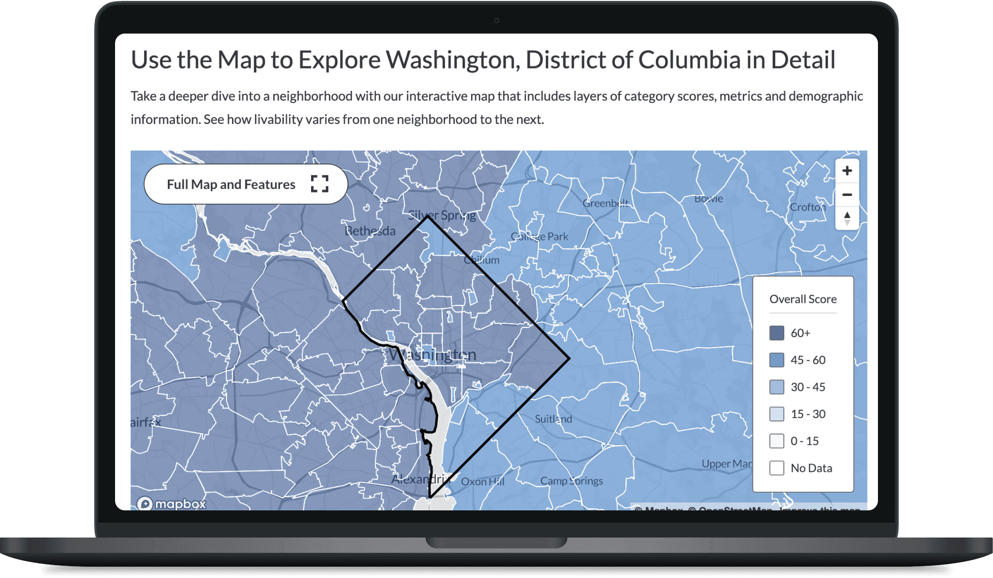
One of the project’s core challenges was translating complex, multidimensional, nationwide datasets into experiences that felt approachable, understandable, and useful for a broad public audience. Users needed to compare communities, interpret scoring systems, navigate maps, and understand how livability metrics were calculated, using these new data visualization tools. The data team at AARP adjusted the data inputs and we needed to accommodate for the massive databases in the new designs, such as with the level of detail in the maps and which communities were available for specific data. The redesign focused on simplifying information hierarchy, improving visual pacing, reducing cognitive overload, and helping users move fluidly between high-level summaries and deeper contextual insights, so they could structure their search in a way that was helpful and relevant to them.
SOLUTION
The redesign introduced a more flexible and accessible visualization system that supported maps, comparison tools, scoring breakdowns, and category-level exploration across multiple device sizes. A major priority was ensuring visualizations remained understandable for users with varying levels of data literacy, technical comfort, and accessibility needs. The interaction system emphasized readability, responsive behavior, visual hierarchy, accessibility, and progressive disclosure to help users engage with complex datasets without feeling overwhelmed. The redesigned platform improved engagement, usability, and discoverability across the Livability Index experience. Ongoing usability testing and iterative refinement continued to strengthen how users explored community data, compared locations, and understood the factors influencing livability across the United States.